McChesney’s take on the media

Our View
Situation:
Eastern redesigned its Web site, and since then, the concise look has lead to a quadrupled number of hits to the site.
Stance:
The new look and features were needed very much and the adjustments do, in fact, enhance usage for students and staff.
Looking good.
And about time.
The clean look of Eastern’s new Web site makes it a class above the rest. The blue and white sleek look makes it more pleasing to the eye, especially to prospective students.
After all, prospective students are looking at numerous university Web sites deciding what college is best for them. And now, Eastern’s site has a more memorable appearance.
The redesign has also improved the site’s functionality and accessibility as well as some new features, which will also attract those prospective students.
The Panthermail link in the top left corner is one of the best features of the redesigned site.
Although, the Web site’s search engine did not work at first, during the middle of August, it is now fully functional. The search tool has two dual threats – it searches the entire Eastern site as well as for an employee or student at Eastern.
The previous gray boxes on the left side of the previous Web site made it difficult for students to peruse. Now, almost all key functions for the students, faculty and staff are well organized.
Even campus life and the importance of alumni take place in the Web site redesign. Another benefit is the dining menus link right on the front page. Before, one had to click on the housing link, then search for this week’s menus, then open the PDF file. Now, the link for the residence halls menus takes the user directly to the PDF files. Although still not the best situation, it is still more direct.
The rotation of stories about Eastern’s accomplishments occupy the main page, but it gives personality to the Web site, and a Web site can reflect the people or institution it represents. Since the majority of people attend Eastern because of small class sizes and small campus, this new Web site is a perfect fit.
“It’s looks like EIU,” said Ryan Gibson, Eastern’s webmaster. “It’s a got feel of the old site, but it’s totally new and refreshed.”
The Eastern Flickr group showcasing Eastern students and photos only relate to that close-knit feeling Eastern students have. The photos, which are showcased on Eastern’s front page, give Eastern students another way to connect with each other.
Although, the Web site is doing a good job right now, it will need to be updated.
Some of the departmental pages aren’t updated and some Web pages need more work.
Gibson knows this.
“That will be the next phase of the project,” Gibson said about the departmental pages.
He said the transformation of all the Web pages will happen during the late fall.
As time goes by, Eastern’s Web site will need another redesign. It’s inevitable. The Internet is constantly changing.
“We can continue to look at trends,” Gibson said. “There will be changes.”
Gibson estimates there will be another redesign in about three years.
But for right now, this will do.
McChesney’s take on the media
Journalism today is in a state of crisis. It is not a profitable business, so it is being allowed to slip away.
McChesney’s take on the media

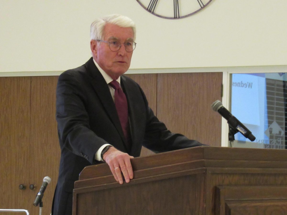
Media critic and expert Robert McChesney speaks about problems involving the media and politics to a full room Tuesday evening in the Physical Sciences building. (Robbie Wroblewski / The Daily Eastern News)

